Intel Inside update
Addis
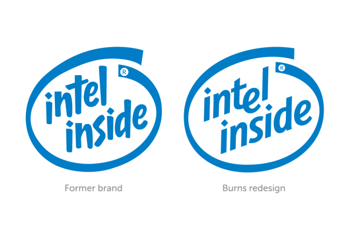
The former "Intel Inside" identity was widely recognizable, but Intel Corporation wanted to change it, to better represent their corporate culture of pragmatism, precision, passion, and confidence. So, I used those attitudes to guide my redesign, while keeping as much equity as I could (using the swirl, and the letters on a slanted baseline). Some time after my redesign, corporate dropped the word "Inside", and went with a different rendering of "Intel", using the new identity for both the corporation and the product.