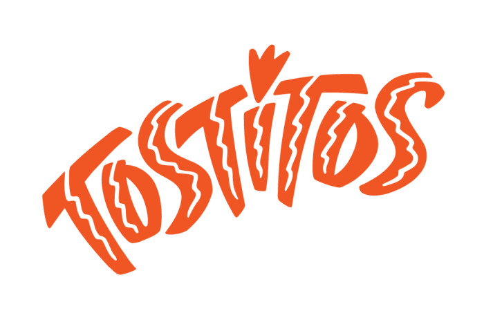
Tostitos
Landor Associates
Proposed identity for the corn chip brand
Ultimately, Frito Lay opted for the current design that cleverly uses the middle "T"s as symbols for people who are holding a chip over the dot-of-the-i-bowl-of-salsa. But I have always enjoyed the playful energy of this design.
